I’m working on building a working customer acquisition funnel for uptimeline.com. Google Ads is my best bet right now, I’m spending about 100$ a month to get about 50 targeted clicks on my landing page every day.
As I’m starting to write this post, I’m listening to this song.
The current version of the landing page is trying to convert these visitors into leads by offering a “free demo” of the product, that will monitor their website for free for 7 days and then send them an uptime report. So far I’m seeing about 1 new qualified lead per day, which is not a lot. That’s not great. Besides that, the few leads I’ve had so far have been rather uneventful. Their websites don’t go down much in the 7 days, so I’m not really sending them any emails, and the few that I’m sending aren’t really getting opened. EDIT: I didn’t mention while first writing this, but also I’m afraid there is some issue in the core monitoring mechanism of Uptimeline which makes it so that a large percentage of the downtime isn’t actually getting caught… Yeah… That’s bad… 🤦♂️
In general, it’s not working right now. I haven’t really improved on the rate of acquisition, which still stands at about 1 free trial with a credit card every 2 weeks to 1 month.
Question: what flow are those few free trialists following?
Luckily, thanks to Hotjar I was able to look into it a bit. The last free trialist, from 10 days ago, has clicked the “try free” button which puts users directly in the insert payment method page. Clearly unideal, this was the main flow before the current one and my thought was that people were getting scared by the fact that I was asking for payment first thing. But the current flow was already up at the time! It’s just that he chose to use a secondary flow instead of the main one. So this highlights one of the big flaws of the current landing page I think: there are so many flows one can take. The funnel is leaking from every side!
Here are the flows one can take right now (that I can think of):
- main flow (insert website, then email, then if you want you can start the free trial). no one has started a free trial through this flow yet.
- register free account flow. By accessing the public register page, you can register a free account! Various people do this everyday.
- Start free trial flow. By clicking on any of the “start free trial” buttons, you get sent straight to the payment page. Many people click on this everyday, and leave from there.
I’d like to solve this issue by not allowing access to any flows but the main one. At the very least this way I’ll remove some of the confusion in the data and hopefully be able to at least understand what’s going on.
Blank landing page
The current landing page is a pretty standard landing page. I want to try something different. An empty landing page, that says no more than what’s strictly necessary. I think this might be a terrible idea, but the hope is that having a blank page will allow me to understand which parts are doing good and which are doing harm, by adding them one at a time and watching what impact they have.
I’m going to start developing it right now as I’m writing.
I’m trying to improve the environment as well while I’m at it. I’ve added an MUI Theme to the project so that next time I can hopefully reuse some of the styles that I’m defining. I should’ve done this a long time ago! But well, better late than never.
It’s done now!
About 4 hours of work later it’s in production. Here’s the result:
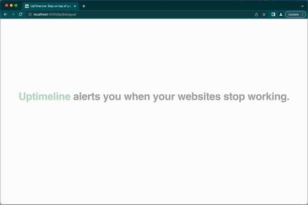
Now I’m going to modify the Google Ads campaign to point to this new landing page. I hope it’s clear now what I meant by a blank landing page. There is literally nothing!
As I start learning how users behave through this flow I can then try adding little pieces of information and see wether they have an impact on the various stages of the funnel. But at least all of the content (or almost) will be based on an informed decision, and I’ve removed a lot of the clutter. Well I guess only time and users will tell if this was a good idea or not. I will write an update here in a week or so with the result.
That’s it!
This was the first article stemming from my new idea of online transparency and blogging about WIP to keep me accountable, and so far I’ve liked it. I’m curious to see how long it lasts and where it ends up!
EDIT: The issues
I forgot to mention. 4 hours from idea to production means there will inevitably be cut corners. Here are some:
- The page isn’t laid out properly on mobile (ie. only usable on desktop) but that’s ok since most of my traffic is desktop anyways
- In the 3rd step of the flow I ask how many websites the user wants to monitor, but step 4 always only allows inserting 1 website.
- The price on the landing page is always in USD, but then the price in stripe is actually variable
- Not to mention, the whole flow isn’t connected to the registration process! (When you start your free trial and register, you get a brand new account which doesn’t even include any of the lead data you gave to me in the initial flow!)
Some of these issues might seem like killers to the untrained eye, but for a startupper these are insignificant issues. Simply every time a user will start a free trial (about once a month 🤭) I will go personally apologise to them for the awful experience. What matters here is the part of the funnel before the conversion. The part of the funnel after the conversion is retention, and I don’t care about that right now. It’s too early to care about that.